Here’s how you can design a blog and hook your visitors with a gorgeous and memorable experience that they’ll love and share. Let’s get started with this complete guide to blog design.
Don’t have a site already? Here’s how to get started with WordPress
The first step in creating a beautiful site is to pick a blogging platform that allows you a wide range of design possibilities. WordPress is my platform of choice. I love it and run all my sites on it. Here’s why:
- It’s open-source with a large community of people using it, loving it and contributing to it. You benefit by having access to thousands of free design themes and plugins that can change the look and feel of your site with a click. All without any design know-how.
- It’s the most popular content management system used to host more than 35% of all sites. Very flexible and extensive so it’s used by everyone from institutions such as The White House and NASA, corporations such as Facebook and CNN to independent sites such as my one.
How to install your first WordPress design theme
Using WordPress will save you weeks of time and a lot of money as you won’t need to build (or pay someone to build) your design from scratch.
The community behind it has created more than 7,000 of WordPress themes that are beautiful and feature-rich. You’ll have plenty of choices for selecting the design template that works for you.
I suggest you access your WordPress admin and get yourself familiarized with the “Appearance” section on the left-hand side navigation.
The majority of your design options will be in there. You can search for, preview and install themes there. See how easy it is to install and activate a WordPress theme.
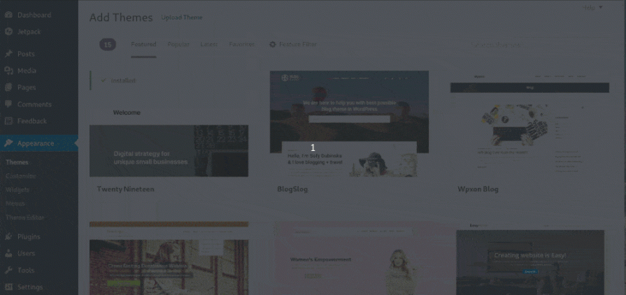
- Visit the Appearance menu
- Click “Themes” within the “Appearance” menu in your WordPress dashboard
- Then “Add New” on top of that page to discover the different design opportunities
- Browse through “Featured”, “Popular” or “Latest” themes. Or use “Feature Filter” to find more specific themes with exact features that you are looking for. Sort by color, layout, features and specific subjects.
- When you find a theme design that you like simply click on “Install” to activate it on your WordPress.
It’s easy to switch between and test different designs until you find the perfect one. It doesn’t affect your content at all. All of it remains untouched no matter what WordPress theme you’re using.
What are the signs of a great WordPress design theme?
Each WordPress theme has a page with further details. This can help you make a better decision. You can learn more details and see how the theme would look on your site. Some signs to look out for in order to discover a quality WordPress theme:
- The last updated date should be recent. You want your theme to be compatible and functioning correctly with all the latest WordPress updates. Older themes might break in most recent versions of the software. WordPress is continuously changing and your theme needs upgrades and latest bug fixes to continue serving you.
- The number of active installs shows you how many sites use the theme right now. The more the better as it shows that the theme is quality, but watch out not to have your site look like thousands of other sites.
- Rating number between 1 and 5 stars. The higher the rating the better the theme may be.
- Look through the reviews to see what people are saying about the theme.
- Does the developer actively respond and help people? Is the theme actively maintained, updated and supported by a reputable developer or company? It would be ideal if the developer is active and helpful.
See my list of all the best WordPress themes.
Mobile phones and responsive design
Smartphone sales have overtaken computer sales. Mobile traffic has surpassed desktop traffic worldwide. Mobile and tablet devices account for more than 55% of global internet traffic.
How to design a blog that looks great on smaller screens or touch screens is another key consideration.
Responsive design is smart and adapts itself to the screen size of the device the user is browsing with and provides optimal viewing experience for visitors. It works on everything from large desktop monitors to small screens on mobile devices.
Google recommends responsive design as the best way to configure your look because it is easier for the user and there is no need for redirection like on other mobile solutions.
If you want to check how your WordPress theme works on mobile devices, take this Mobile-Friendly Test from Google.
What WordPress theme is that site using?
An alternate way to nice design is to go to your favorite sites and discover what theme they use. When you find a site that you love it’s pretty simple to see what design it uses.
- Visit the site in question
- Right-click anywhere on the page in your browser window
- Click on the “View Page Source” in the right-click menu
- On the HTML source page, search for and find “style.css” or “/themes/“
- The line of code you find will look something like this: domain.com/wp-content/themes/theme-name/style.css
- In place of the “theme-name” you would have the name of the WordPress theme that site is using
- Alternatively, you can also click on the “style.css” link
- On the top of style.css file, you will find further details such as the theme author and the URL where you can learn more about the theme
So now you have all the details that you need to find what theme a site is using. It takes two minutes. No fancy WordPress theme detector tool needed either.
Now you can go to the Appearance menu in your WordPress dashboard, search for and activate the theme that you just discovered.
Note that some sites use a custom WordPress theme solution that’s built from scratch. Some try to hide their theme name for one reason or another. This makes it pretty much impossible to know the theme name unless you ask them.
Best free WordPress design themes
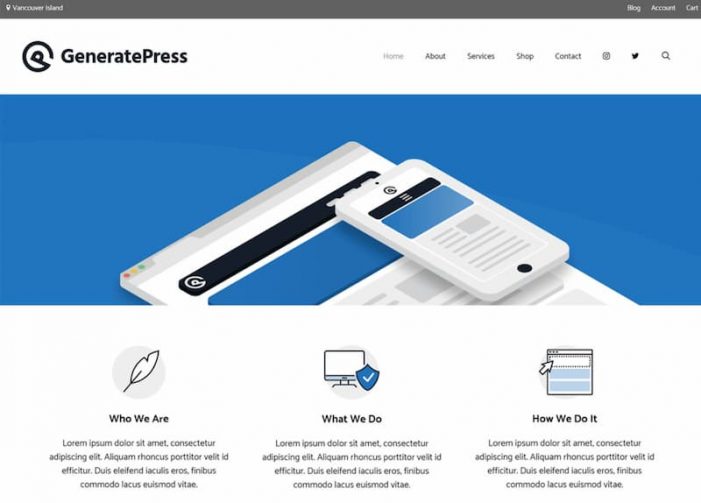
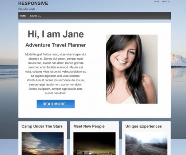
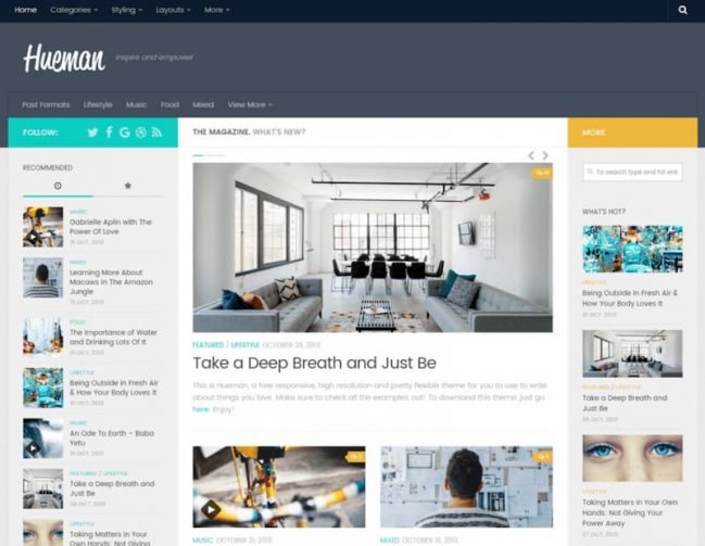
This is the list of some of the most impressive free WordPress themes that I have handpicked for your inspiration. They feature everything you should be looking for in a design theme.
They’re beautiful, minimalist, mobile responsive, clean coded, fast loading, lightweight, constantly updated and fully supported by the developers and the community.
Consider also some niche themes specialized in different topics such as those for travel blogs or fashion blogs. See for instance how to start a fashion blog for more details.
Premium WordPress themes
You’re not only limited to the free themes. There are many great premium WordPress theme providers. You typically need to pay per theme you want to use or you can buy the total packages of all their themes in one. Here are some of the big names in the WordPress premium themes space:
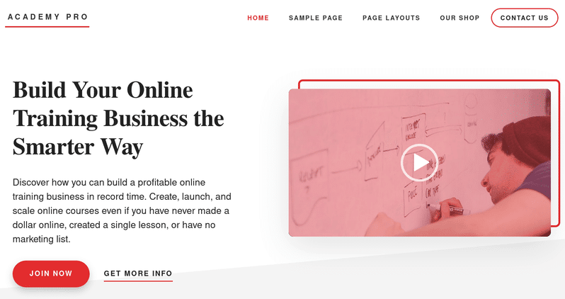
StudioPress: Genesis by StudioPress is one of the most popular premium themes. They have created a large variety of themes for different use cases. I use the Academy Pro theme on this blog now. 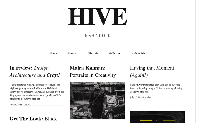
Pixelgrade: More than 20 different premium themes for WordPress blogs. Everything from magazine themes to themes created for small businesses and restaurants. 
TemplateMonster: Not exclusively focused on WordPress but they have a large range of premium WordPress themes too. More than 2,000 at this time.
Dark mode vs light mode
Dark mode is a modern trend in web design. It was also recently introduced in the different mobile and desktop operating systems.
It’s a very subjective topic. Some people prefer to view sites with the light mode while others love the dark mode. You could ask your audience what they want, you could make a choice for them or you could let them decide themselves.
This is what the research says on the impact of the light and dark mode on our eyes:
In people with normal vision (or corrected-to-normal vision), visual performance tends to be better with light mode, whereas some people with cataract and related disorders may perform better with dark mode. On the flip side, long-term reading in light mode may be associated with myopia.
There are several WordPress plugins that allow you to have a dark mode design on your site. Blackout and WP Night Mode plugins help you give your visitors the option to switch to the dark mode.
Many themes allow you to change colors including the default Twenty Twenty theme. Then there are also dark themes such as Bold Photography.
The most elegant version may be to set your theme to follow the preference that the user has set on their operating system. You can do that using CSS by inserting a piece of code into your style.css file.
This “prefers-color-scheme” CSS option is what I use on my site. Try it by visiting my site with dark or light mode enabled on your device. The code will look something like this but you will need to experiment with it to get it right for your theme:
@media (prefers-color-scheme: dark) {
    html {
        background: black;
        color: white;
    }
}
How to use Customize to improve your design theme
WordPress “Customize” section within the “Appearance” menu allows you to preview how your content looks like when using a particular theme.
You can also create your navigation menu, change your site’s header logo and edit the widgets in your sidebar. Here are the essential elements to think about for your “Customize” section:
Fonts and font sizes to use
Font, font size, the spacing between letters and line-height all have a big impact on how your visitors feel when reading online.
Screen resolutions are increasing which means that you need to make your content more readable for these new screens. Larger font makes your site more clear and easy to look at.
Sans-Serif Fonts are best suited for digital content while you want your font size to be a 16pt at a minimum and should go even more to 20pt+ for best results.
Some WordPress themes are very well optimized for typography out of the box. Page Builders make it easier for you to change the font type, size, and colors too.
You could also install the Easy Google Fonts plugin which makes it easy to change your fonts and font sizes in the different areas of your site in a simple and visual way.
The plugin gives you access to hundreds of beautiful web fonts for you to pick from and use.
A color palette of your choice
All the good themes already come with their own color schemes if you’re going to customize your post background color, font color, logo and more, it’s good for you to learn a bit about colors.
Color palettes can make or break your post. As a non-professional designer, I tend to get inspired by big brands and colors that they use.
This is a perfect website for you to see what color palettes big brands use. These companies have many people working on their branding and have done extensive research, so it’s useful to learn from them.
Colors also convey meanings so it’s useful to be aware of what your content is projecting when you’re using a certain color.
Your logo and navigation menu
Having a great header section is important as that is the first thing people see when entering your site. It’s what makes you stand out and be recognizable in the endless pool of bloggers.
Make sure your header looks professional and showcases your personality and what your site is about. Here’s how:
- Include a descriptive but brief tagline. Tell visitors what’s in store for them, what your site is about and what problems your content will solve for them. The purpose of your site has to be clear and immediately evident to your first-time visitors.
- Introduce yourself right off the bat with a welcoming message and smile. Ingrain your personality. Include your image. Your site is unique, but only because of YOU, so make sure your visitors see this as soon as possible.
- People like familiarity so make your visitor feel at home. Include a clear navigation menu at the top. Think about what pages or posts you want to put into your navigation to best present your site (contact, about page, services, etc).
- Consider making your navigation sticky. Many sites now fix their navigation menus to the top of your browser window so the menu follows you as you scroll down the page. This helps the visitor easily navigate your site at any time and gets them to explore your content deeper.
- Distinctive logos can work wonders. Many sites feature text-based logos. These can work great, especially if you’re using one of the cool fonts I mentioned earlier in this post. There are also some fast logo makers for non-designers such as this one.
- If you want people to stick around, make it easy for them to find your content. Display popular posts, key guides, and have a prominent search field. Consider a live search plugin that works very much like Facebook or Google search works. Upon starting to type a search query your visitor will get a drop-down of your posts. It is a faster way to search.
- Display social proof such as social media follower size, number of social media shares and number of comments. If visitors see that your site is popular, frequented and shared a lot then there is a greater chance they will stick around. If all these people like this site then there must be other good stuff around. Use WordPress plugins to integrate social proof.
To sidebar or not to sidebar
Sidebars tend to be very cluttered with things like social media buttons, search buttons, archives, ads, and even word clouds. And for mobile visitors, they load all the way at the bottom of the screen contributing to slow loading speed.
Review your sidebar. Do you really need everything that’s in your sidebar? How can you make it more focused so it leads your visitor to discover your content deeper and access your key posts? Do you need a sidebar at all?
When scrolling through a post you would have the sidebar towards the top but the more you scroll, the more white space there would as the sidebar is finished. This is a waste of valuable space.
Put in a sticky widget in your sidebar so it scrolls through with the visitor. You could have a subscription widget sticky to increase the number of subscribers or social media followers.
Or you can stick your popular posts to get more clicks and help people discover more of your content. Q2W3 Fixed Widget plugin allows you to do this.
Every post is a potential starting point
It’s not all about your home page design. Majority of your first-time visitors come directly to your individual posts. Social news feeds and search engines tend to drive people deeper. These visitors might never see your home page.
Bloggers tend to focus on their home page too much spending a lot of time prettying it up and neglecting the rest of the site. This is a mistake.
Use a Page Builder to build on top of a theme
The easiest possible solution to design a site is to simply pick a theme that you really love as it is and have no need to customize. Then you’re ready to go and conquer your niche as soon as you activate the theme.
If you’re not comfortable with coding, then it’s best to choose a theme that makes it easy to edit and customize even with no coding skills.
The ability to customize your design with a simple and easy interface varies a lot from one WordPress theme to another. Some have drag-and-drop, user-friendly interface. Some can only be edited and customized by CSS and coding.
Most themes are not easy to edit and that’s where page builders come into the picture. Page builders are plugins that work on top of any theme and allow you to build and customize your layout with a simple drag and drop interface and no need for coding.
Page builders allow you to create a professional and unique looking site without any design know-how.
- How would you like to present your content?
- What colors do you want to use?
- Would you like your posts and pages to be very unique and different from each other?
- What about one sidebar or two sidebars or maybe none?
How about sidebars on the left or the right or both sides of the content? Would you like a big call to action? Or a full-width section? All these and many more are easy to do with the help of page builders.
These are the three most popular Page Builders that I recommend you try and choose the one that fits you best:
“Keep it simple, stupid” to have a fast loading site
First-time visitors take less than a few seconds to decide if your site is worth exploring. You have to get their attention and get it fast with effective design.
Think of usability. Visitors should enjoy not only the aesthetics of your site but also the ease of use, page speed, and user-friendliness.
Consider how the design affects your speed and the visitor’s experience and aim for your site to be loaded within a couple of seconds at most.
Make your site easy on the eyes and clutter-free. Less is more in modern web design. Simplicity rules. It gives your visitors a better experience when browsing your content. It puts more emphasis on the content itself and makes your site load faster.
Just because you’re starting a YouTube vlog doesn’t mean you need to place five YouTube embeds on every page. Consider these things:
- Ignore and remove inessential design elements that don’t matter. Remove buttons, widgets, ads, pop-ups and other distractions. Just because every other site has them, it doesn’t mean that you need to have them too.
- Do you actually need all those social media share and follow buttons? Do they actually get any clicks or do they just distract people? Focus on those buttons that have the biggest impact on your audience. And use the lightweight versions instead of the official buttons.
- Refrain from adding what is not necessary in the first place. Think about what purpose any design element has? You don’t need features that nobody has asked for and that nobody is using. Focus on quality, not on quantity to make room for those elements that do make a difference.
Here’s my guide on how to speed up your WordPress site.
Feeling a bit overwhelmed? Whatever you do just don’t spend too much time thinking about design. No matter how beautiful your site is, it will never grow without you spending time on creating great content and attracting visitors.
It’s the real world and the actual visitors that will lead you towards making better design decisions in the future. So pick one of the nice design themes, customize it a bit and get it out into the wild quickly.
